By Maria LaPiana
In many ways, this was a textbook interior design project: a mix of serendipity and trust, good timing, styles that mesh, and a rare case of everything going according to plan.
You could say the stars aligned to produce a seamless makeover of this family home in Castle Rock.
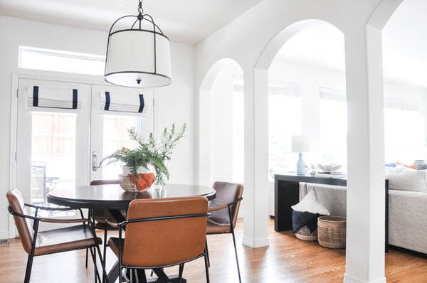
What started out as a dark and dreary home was transformed into a modern, open space with crisp, clean lines and joyful bursts of color. The project encompassed the main floor: the living room, dining room, entryway, powder room, laundry room and staircase. It was every designer’s dream.
The homeowners chanced upon the Basil + Tate interior design website and fell in love with the work of lead designer Jackie Newell. “I really didn’t know where to begin,” says Monika Wesorick. “I previewed her website and portfolio of work, and her bright and modern style resonated with me. I wanted something modern, but warm and inviting and her past projects fit that style.”
Purchased as a new build in 2006, the home was showing its age. The main level had been painted in dark tans and light browns, and most of the furniture was finished in an unfashionably dark espresso. “The decor felt dated and haphazardly put together, with no particular style,” remembers Wesorick.
Enter Newell with her team and everybody agreed the drab, broody interiors had to go. “The goal of the project was to give the main floor a makeover without doing any major construction,” says the designer. A few minor structural changes made all the difference. “There were already three archways that added a lot of character to the main floor, but we got the green light to update the TV and fireplace wall,” says Newell. “Architectural details truly make a home unique.” She credits the talented team at VIP Construction in Denver for doing an awesome job on the millwork.
A pleasing palette and some surprises
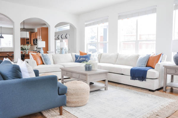
The client’s overall directive was that the space be functionally beautiful and family-friendly. “To me,” says Newell, “that means choosing fabrics and materials that are easily cleaned and able to withstand day-to-day use. Monika had her heart set on a color palette that included navy and camel-colored leather. She also requested that we try to work in a sectional instead of two sofas so that the family of four (they have two sons in middle school) could curl up together to watch TV.”
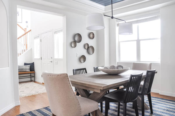
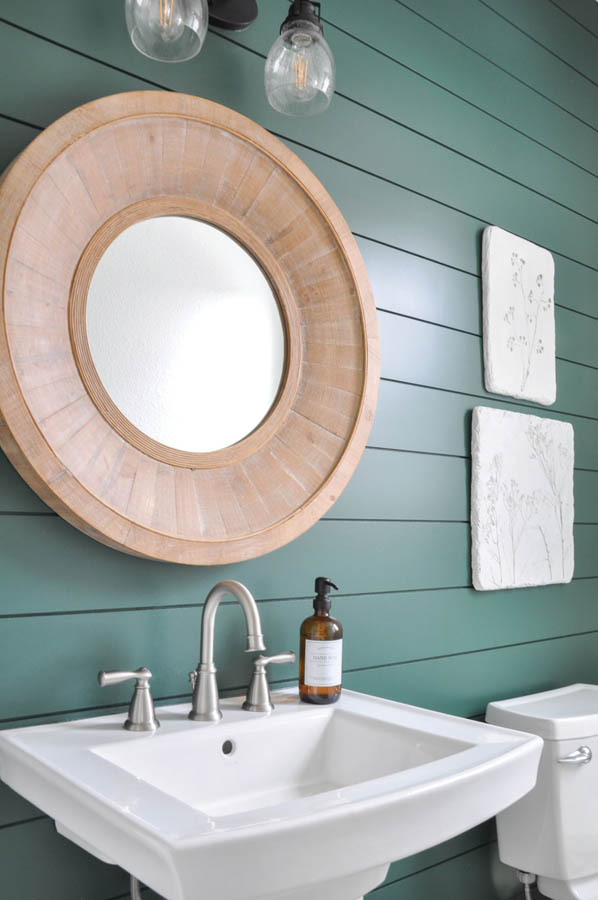
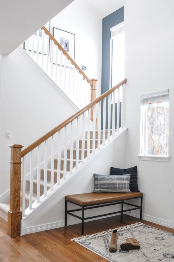
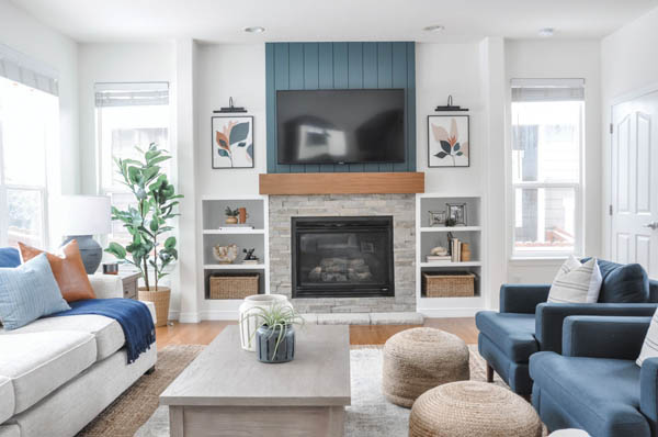
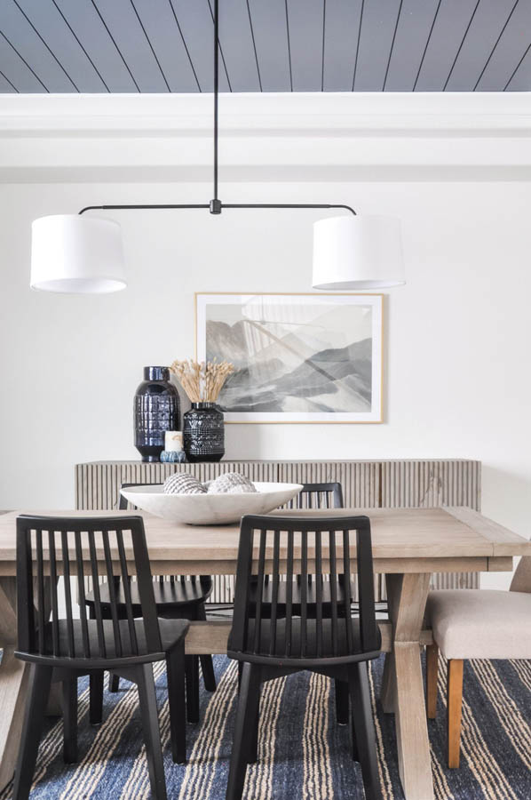
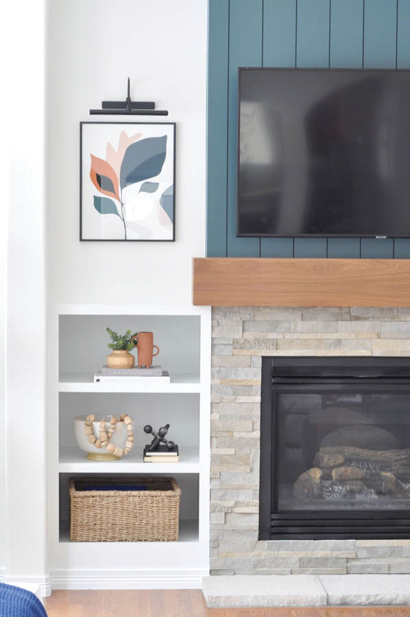
Newell did all that, and more. She infused the home with a pleasing brightness using Greek Villa paint by Sherwin-Williams. She uncovered the windows and lowered the ceiling fixtures to give the open plan some breathing room. She added subtle coastal notes—shiplap in the powder room, on the fireplace wall and inside the dining room’s tray ceiling—and imbued the home with a relaxed vibe throughout.
Comfort and texture own the day in the living room, while the gently layered dining room features a navy tray ceiling and striking Meadow Blu sideboard.
It was important to find just the right artwork for every space, says the designer. She chose stylized florals for the fireplace wall: “We wanted the artwork to be simple, so it wasn’t competing with the other decor.” She opted for mountains in the dining room because they’re important to the family, and dimensional art on the opposite side of the room to add variety and texture. A simple gallery wall of black-and-white family photos personalizes the stairway wall.
The project began in the early days of the pandemic, so Newell remembers the frustration of waiting for furniture to arrive. But the transformation was well worth the wait.
“Our favorite room is the living room,” Wesorick says. “The boys wanted a big, comfortable sectional, and Jackie delivered. We all love lounging together in there. The fireplace and TV wall remodel is one of my favorite upgrades. It feels sleek and streamlined. And I love the bold moody color behind the mounted TV; it’s such a rich deep tone that really pops against the white walls and warm walnut mantel.”
Both client and designer agree the home is now the perfect mix of modern and traditional. It’s also extremely adaptable for entertaining. At the end of the day, Wesorick says the makeover didn’t really change the way the family lives in the home: “That’s the best part. Our home continues to function the way it always has—but with an elevated and cohesive style.”
How pleased are the homeowners with the end result? Very. Newell says she’s in the process of finishing up the primary suite. “It feels like an extension of their beautiful main floor: shiplap ceilings, wood beams and a dreamy bed. It’s going to be great.”
Basil + Tate
VIP Construction

