Some would call it an ugly duckling. But until Christy Vranesic Brant and Caitlin Marsh, the mother-daughter team behind lulu’s furniture and decor, came to the rescue with their designer eye, homeowners Jim and Terri Garofalo had one word for their awkward living area: useless.
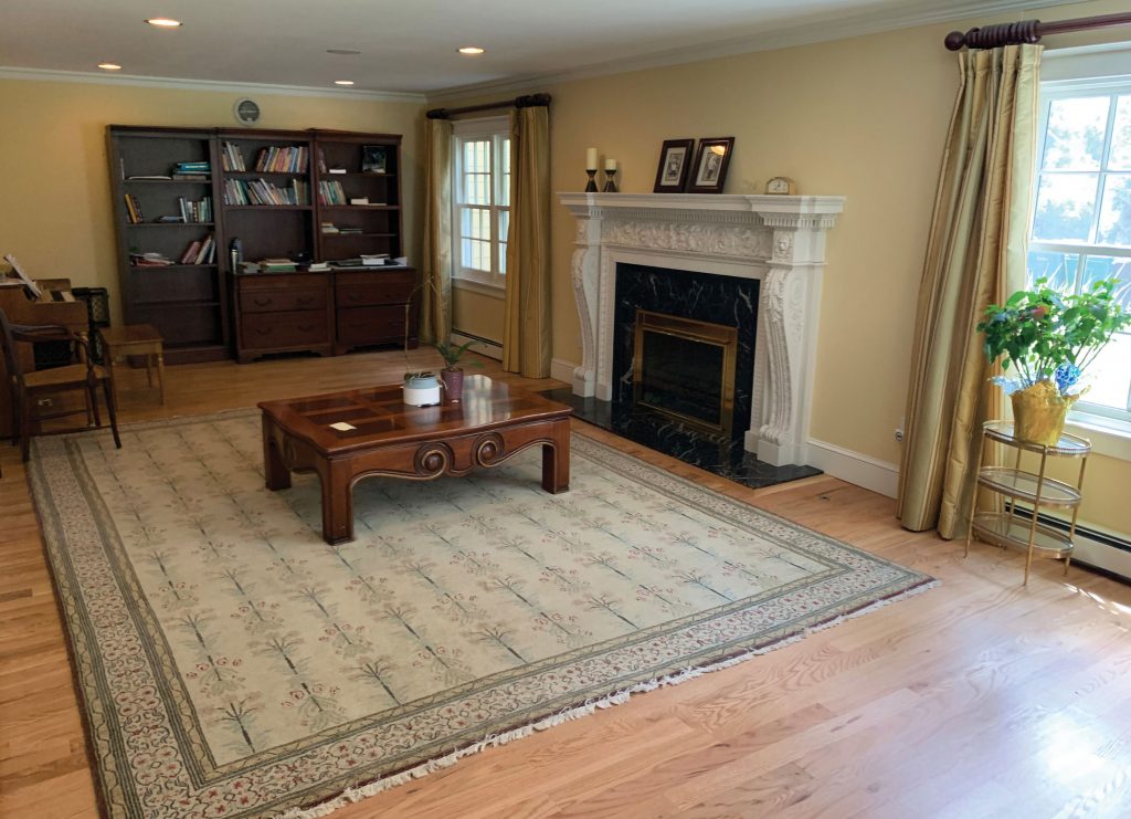
By mid-2019, the Garofalos had all but finished a full remodel of their Cherry Hills Village home. They opened up the kitchen. They added an open-concept great room to their floorplan. Overall, they reconceptualized. And yet, there was still this untouched long and narrow living room (pictured above) that was now even more of an eyesore after the updates.
“The furniture [which was traditional, beige and from a Garofalo furniture-buying trip 20 years back] didn’t fit. It looked awkward and we never—literally never—went in there,” Terri says.
So they didn’t have much to lose when they entered the AvidLifestyle room makeover contest last summer, held in partnership with lulu’s. Marsh and Brant were offering the winner interior-design services and a $1,000 shopping spree at their Kent Place boutique. Fate, it turns out, could not leave this room be either.

The design duo’s first impression: “It was so dated, it was like everything was yellow,” says Marsh. “There were these weird spaces where there was no furniture, and then ten feet away, some furniture.”
The Garofalo’s design directive: “We just wanted a cleaner, nicer look—though not necessarily modern,” Terri says, describing their style as transitional. They also wanted a room where they could entertain, where conversation would flow with guests and where the couple could relax away from the rest of the house … and the kids.
The redesign started by getting rid of everything in the space and dressing things up with a fresh coat of Benjamin Moore Silent Night paint, a blue-gray hue, to match the rest of the house.
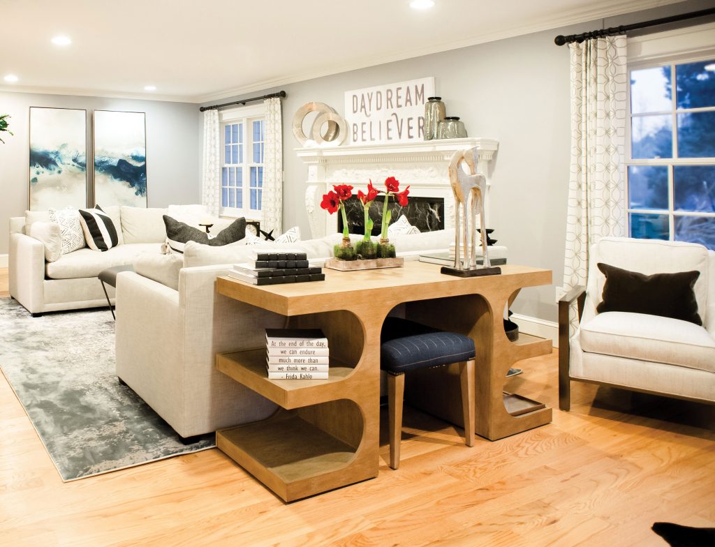
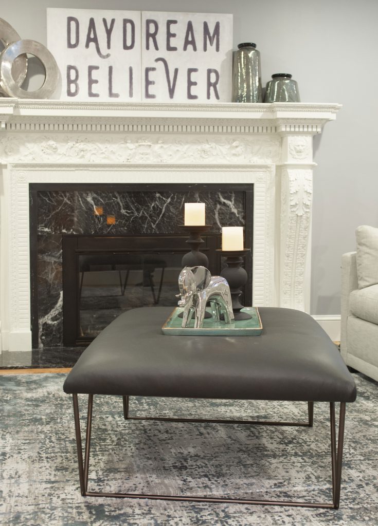
Marsh and Brant made the room’s existing black marble fireplace, complete with carved wooden details, the center of attention.

The room is noticeably (and purposely) missing a TV. “We wanted to leave out the TV so it was more of a conversation, relaxing and reading area,” Jim says. Photo by E.J. Carr 
The lulu’s team went sparse with accessories due to Jim’s proclaimed dislike of “clutter.” Photo by E.J. Carr
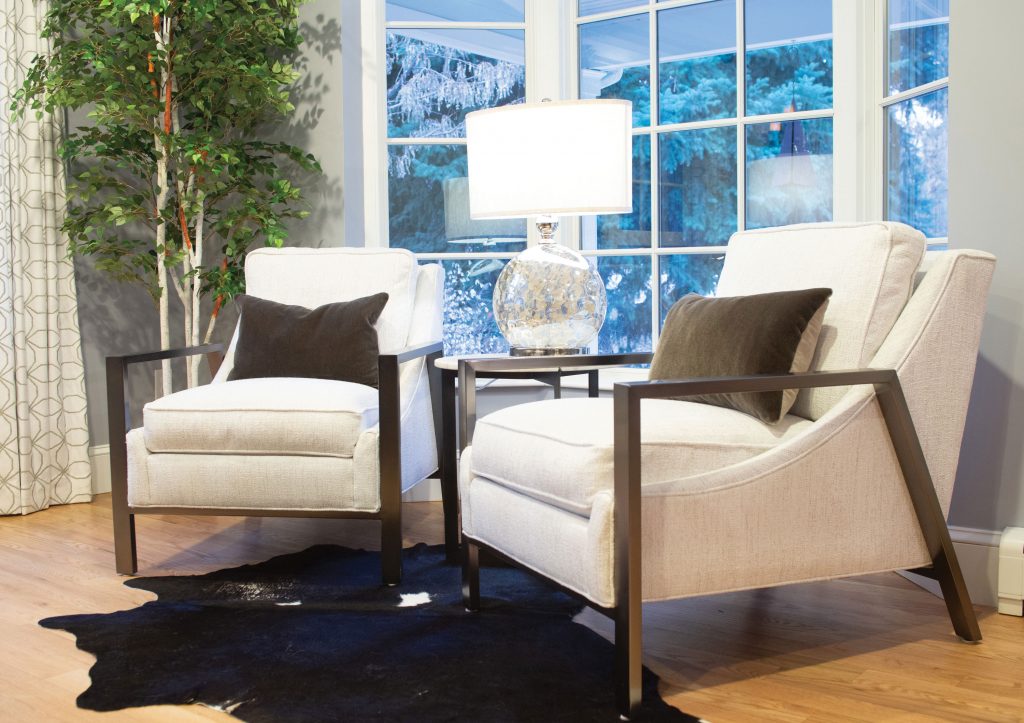
Light gray Robin Bruce sofas, which feature a low profile and bench seats, now frame the hearth; an ottoman and console table round out the stretch between. Behind one sofa sits a sofa table. Settling into another corner of the room are two white chairs with black steel arms, also Robin Bruce, that create a kind of nook.
For the décor, Marsh hand-selected items from lulu’s: “We wanted to funk it up a bit because this room is a pretty formal room, and they wanted to make it more casual—a place to hang out.” Atop the mantle she placed a wood sign and some metal curios to bring “layers” to the space. Around the rest of the room, Marsh kept the details simple with a few more metallic accents and a big, round mirror to add depth. A large Loloi textured area-rug ties everything together.
Now guess where the Garofalos like to spend their time. “Everything they picked out looks really nice and fits beautifully,” Terri says. “This is where I want to sit in the morning, having my coffee and reading the newspaper.”
GET PLANNING
lulu’s furniture and decor
Kent Place
303.756.2222


