Metro Denver’s restaurant scene tops the charts with diverse menus, inventive libations and an unforgettable dining experience that leaves both locals and visitors craving seconds. But there’s more to our favorite hangouts than meets the eye—behind every bustling bistro and cozy cafe is a meticulously thought-out design that brings delectable foodie dreams to life.
SUSHI RAMA, PHOTOS COURTESY LIVSTUDIO
SUSHI-RAMA
Belleview Station: 720.667.1195
Lone Tree: 303.537.5250
RiNo: 720.476.4643
sushi-rama.com
THE VISION
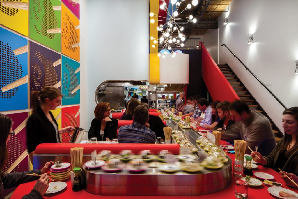
After designing the first Sushi-Rama in RiNo, Brandon and Tana Anderson of LIVstudio were more than ready to take on two of the unorthodox eatery’s additional locations in the Lone Tree and DTC neighborhoods. Though each of the spaces couldn’t be more different, the Andersons’ vision was the same: to create a conveyor-belt dining experience reminiscent of the 1950s when pop art made a grand entrance on the world stage.
INTO THE ATOMIC AGE
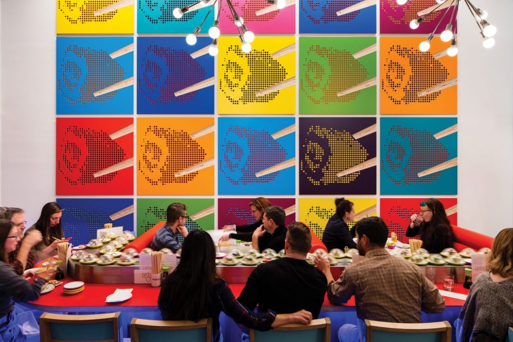
Sushi-Rama owners Chef Jeff Osaka and developer Ken Wolf originally posed the idea of a “retro-mod” sushi joint, which the Andersons built upon with fun, colorful elements of the atomic age. Quirky sputnik chandeliers were hung among bright red, yellow and blue bands throughout the ceiling, which mimic the conveyor belt movement below, while each project was lit with “light clouds” (more on those later) and vivid pop-art squares were hung along the walls. To make things even more out-of-this-world, the Andersons installed a robotic hand that slides unclaimed sushi pieces off the conveyor belt into the trash after they’ve made their rounds.
CONVEYOR-BELT DINING
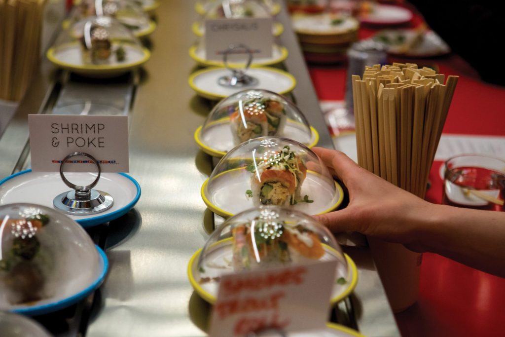
The conveyor belt is the focal point of each Sushi-Rama project, with bar-style seating along a parade of individually plated and covered sushi pieces. However, each location greatly differs in shape and size—RiNo is tall and narrow, Lone Tree is slightly wider and DTC is two to three times bigger than the others—so the Andersons adjusted their conveyor belt prototype as they designed to maximize each space (plus added a full bar at Sushi-Rama DTC). They also drastically scaled up the pop-art panels to create a collage of color on the larger walls.
ABOUT THAT POP ART
1950s-style pop art was central to the design, so the Andersons mimicked what popular artists of the time—like Andy Warhol and Roy Lichtenstein—were doing. The duo designed abstract sushi art on colorful plastic laminate squares and lined the walls with them to create a futuristic-meets-retro vibe, almost as if you enter into an Austin Powers set the moment you step foot in the door. The Andersons even joked with Osaka and Wolf that if Warhol and Lichtenstein had a sushi baby, it would be Sushi-Rama.
MUSIC TO MAKE YOU MOVE
Aside from the conveyor belt and ’50s-inspired pop art, you’ll know Sushi-Rama by the mood music bumping from the speakers. “To create a multisensory experience, we curate playlists that tie into our intention of being fresh, fast, fun and family-friendly,” says Osaka. “When we open, we typically start the day with something a bit calming but upbeat (think “Circles” by Post Malone and “Watermelon Sugar” by Harry Styles), then we bump the energy up a bit for happy hour (like The Weeknd’s “Blinding Lights” and Beyoncé’s “Mood 4 Eva”) and bring that energy through dinner.”
In order to optimize the acoustics of each location and keep any (extra) noise to a minimum, the Andersons installed glowing light clouds in the ceiling along with those thick, perforated art panels on the walls. According to Osaka, the locations are meant to be a party, but with minimal disruption to the overall dining experience.
PHOTOs: courtesy studioatlantis
LE FRENCH BAKERY & CAFÉ
Belleview Station
720.710.8963
lefrenchdenver.com
THE VISION
To transport diners to an upscale black-and-white Parisian café that has a knack for making you feel at ease—that was StudioAtlantis senior designer Alexis ‘Ali’ Crumb’s central theme in her Le French concept.
ELEGANCE REIMAGINED
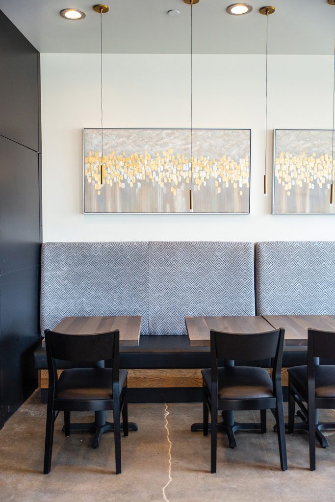
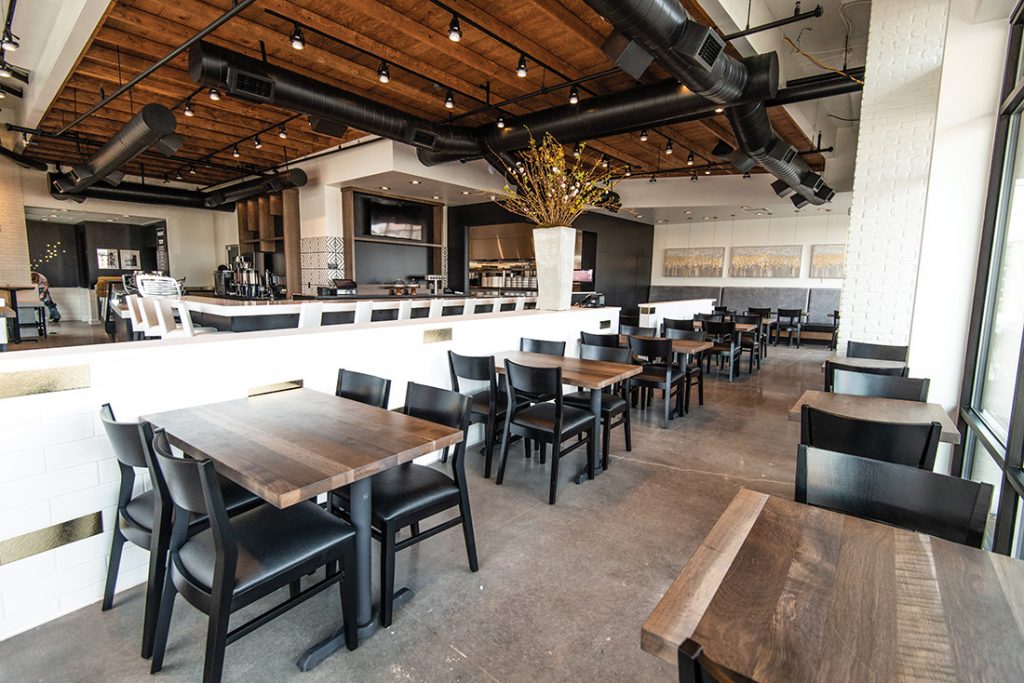
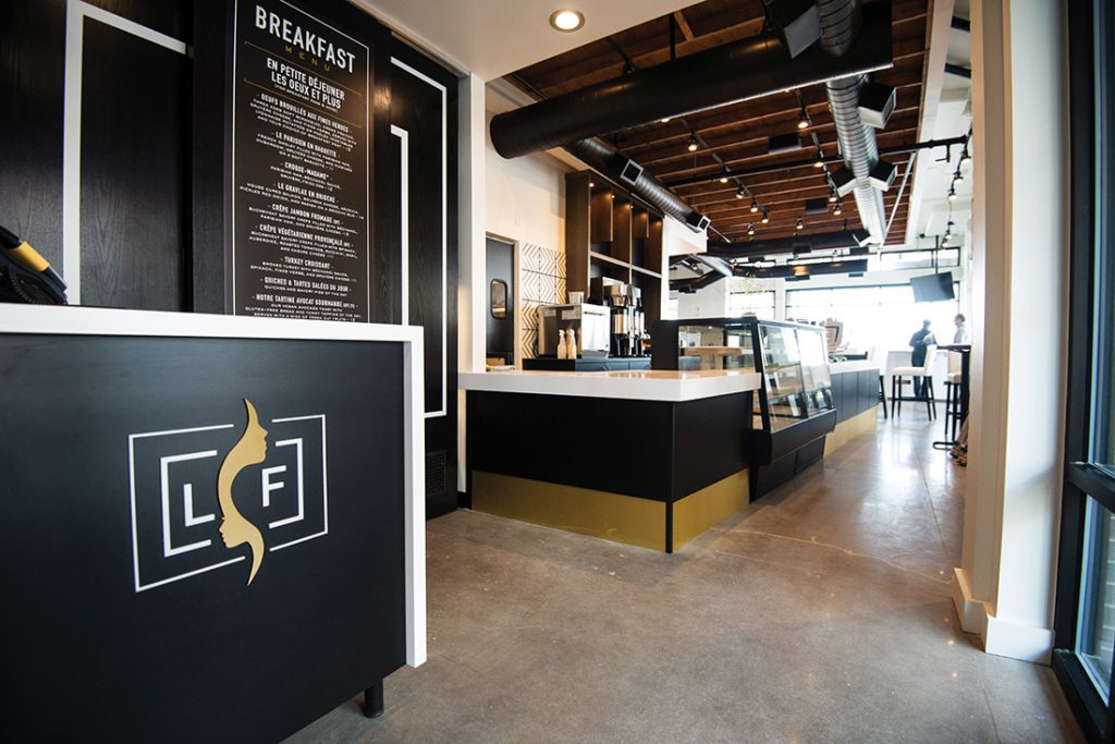
Aminata and Rougui Dia wanted a strikingly elegant space that matched their elevated Parisian cuisine, which has a global twist unlike any other café in the south Denver area. A nod to the sisters’ Senegalese heritage, Crumb mixed sleek and luxurious elements of traditional French minimalism—opting for clean, sharp angles with the stark, contrasting black-and-white colorway—with warm ceiling lights, gold décor, wooden tabletops and an exposed wooden ceiling that highlights the marble-esque detail throughout the floor.
DINING ROOM MEETS GRAB-AND-GO BAKERY
Previously home to a different restaurant, the layout of the space presented a unique challenge for Crumb: the kitchen jutted out from a far corner well into the main dining room. So, in true Parisian fashion, Crumb framed the kitchen with the grab-and-go coffee and pastry bar, then arranged the surrounding tables to create natural aisles and built a white half-wall to further separate the dining area from the “corner bakery.”
NO EAVESDROPPING
Another element Crumb took into account was the acoustics of the space. With an open floor plan and minimal separation between the kitchen, bar and dining room, a packed house would be uncharacteristically noisy for a quaint French café. To soften the commotion, Crumb installed additional paneling in the exposed wooden ceiling, spaced out the tables and added lofty two-top seating.
A BREATH OF FRESH AIR
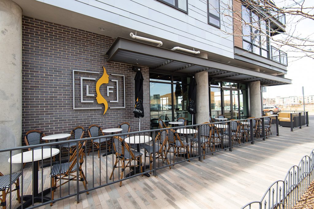
Many authentic Parisian cafés have patios along the sidewalk, so naturally it made sense for Le French to have a similar outdoor dining spot. Mimicking the French style, Crumb brought in checkered bistro chairs and round tables with collapsible umbrellas to create a more casual (and socially distant) option. This type of patio design, Crumb says, is not the usual go-to motif in the U.S. because circular tables offer less table space, but it was the perfect way to soften the sharp angles inside.


