By Kathryn O’Shea-Evans & Kendall Kostelic
There’s home design, and then there’s Home Design. “I don’t think people realize the psychological power that design can have on them,” says Gina D’Amore Bauerle of D’Amore Interiors. “There are so many subconscious things that happen when you’re around a design that makes you feel good.” You know the instinct—it’s the one that decided your favorite quarantine home hangout. We interviewed local designers on key areas that work, and sussed out the reasons why homeowners love them so much. Call it a new kind of happy hour.
À La Alfresco
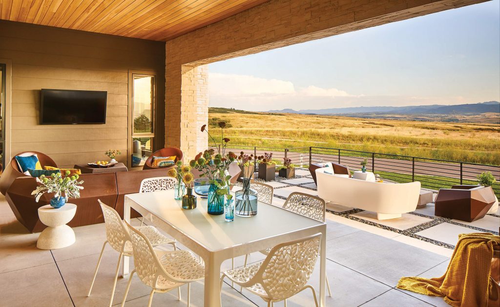
Man’s need for fire is as primal as it gets: gathering around dancing flames has, for centuries, buoyed conversation into the wee hours. So it’s no surprise a gas fireplace takes center stage for the homeowners of this patio, part of a modernist home in Highlands Ranch’s BackCountry, bordering Cherokee Ranch and Castle land. What better place to gather round with a glass of your favorite tipple for an evening of storytelling?
In a place where the Front Range meets the plains, being able to enjoy the simple pleasure of taking in the surrounding panorama was a big item on the wish list for these locals. This challenged the outdoor space’s designer, Joshua Ruppert of Denver-based landscape architecture and design firm Lifescape Colorado, to let nature speak for itself. “Sometimes less is more,” the designer says, adding that the house was rotated and raised on the lot to capture the best views. “Everything should have a purpose.”
The homeowners made their outdoor haven complete with a sculptural duo of chairs and a sofa from Vondom to flank the sleek firepit. The furniture echoes the contemporary home’s asymmetrical lines and provides prime perches for relaxing. “The homeowners did a wonderful job with the furniture selection, along with subtle accents in color [such as throw pillows] that worked with the landscape,” Ruppert says. “They’re all about fun and enjoying the outdoors. The furniture suits them and their personality, as well as the patio. It’s very organic!”
Edging the perimeter of the lot’s footprint: a court that’s set up for basketball and other sports. “The homeowners wanted to keep things simple, which works well with landscape,” Ruppert says. “The ball court is recessed below a gabion rock wall and is encompassed with native grass and trees.” Having it there is like leaving a deck of cards on the coffee table—it encourages both the family and their guests to have fun and a sense of play.
Courtesy Lifescape Colorado 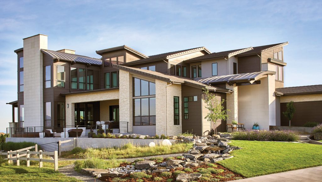
Courtesy Lifescape Colorado 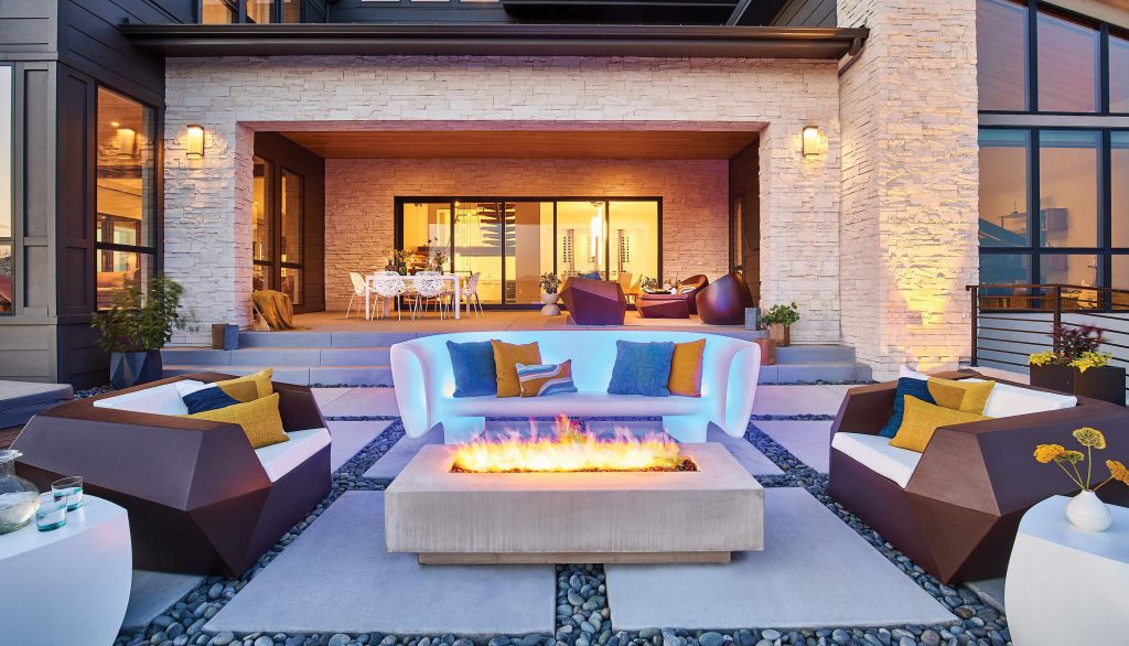
Courtesy Lifescape Colorado
LET THERE BE LIGHT
Soft, warm outdoor lighting sets a magical mood that sprinkles every evening in proverbial fairydust. The varied heights of sconces on the outdoor walls and garden paths look a bit like fireflies; encouraging the eye to wander the skyline of the space, while still flitting both high and low.
MATCHY-MATCHY
The unified hues are extra pleasing to the homeowners’ eyes, even when it comes to the flora. “When designing, I like to keep with a simple plant palette that matches with the architecture of the home and its surrounding area,” Ruppert says. “Don’t force anything!”
EARTHY ELEGANCE
To suit the terrain and give the homeowners a mostly fuss-free garden they could feel easy in, Ruppert selected regional plants like aspen trees, Rocky Mountain sumac, rabbitbrush and leadplant. “We peppered them along with the native grass and wildflowers,” he says. “The idea was to blend the back portion of the yard with what was already there.”
BEAUTIFUL BALANCE
Placing furniture and accessories symmetrically is a timeless tactic that’s inherently pleasing and calming to the eye (partly because humans are mostly symmetrical themselves)—something these homeowners can tell you all about.
EYE CANDY
Choosing a restrained, streamlined firepit draws the homeowners’ eyes to the flickering flames themselves, making them the star of the show. This particular sleek, American-made firepit was hewn of glass-fiber-reinforced concrete from Denver-based Nisho.
TEXTURAL TREAT
Even patio flooring can be pretty enough to bring joy to those who use it. Underfoot in this sitting space, Ruppert created a graphic base where parallel lines juxtapose against earthy stones in varying shades of gray. “I liked the contrast with the raw concrete and Mexican beach pebbles,” he says. “The pebbles helped give a softness to the area.”
LIFESCAPE COLORADO
303.831.8310
Kitchen Confidential
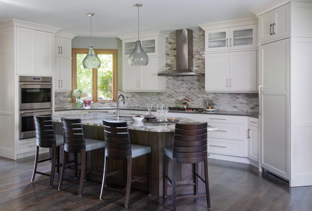
It’s not easy to merge timelessness with modernity, but the results can be as comforting to home cooks as a kitchen in a Nancy Meyers movie. So is the case with the homeowners now basking in this Greenwood Village cook space designed by Corinne Ekle, owner of Greenwood Village’s c2Design. Built by John Reither of Castle Rock’s Reither Construction, Inc., it combines the classic (sky-high cabinetry trimmed with crown molding) with the cutting edge (pendant lights that appear to float dreamily, almost like blown bubbles, above the island).
And while the kitchen is as worthy of a magazine spread as any, the look goes way beyond beauty: the space is newly functional, thanks to some layout swaps that would satisfy any Julia Child-level chef but, most importantly, send the homeowners over the moon. “We completely reconfigured the layout and changed the way the homeowners work and live in this kitchen space,” Ekle says. One prime example: they moved the sink, formerly tucked away in a corner, to center stage by placing it in the middle of the island, making it easy for the homeowners to navigate from all angles. Another exchange: “We moved the cooktop, in the island previously, to the back wall to create a focal point with the hood,” explains the designer. “And we moved the refrigerator, from where the bar is now located, to the angled wall.”
It all makes for a flowing, cozy cook space where the residents can live the dream—i.e., whip up meals easily. One of the spots they host guests is in the showstopping dining nook, where a round dining table encourages conversation and a boxed beam ceiling imparts the feel of a storied hunting lodge overhead. The abundance of blonde woods throughout says “cabin cool,” especially in Colorado.
Photos by Emily Minton Redfield, courtesy c2Design 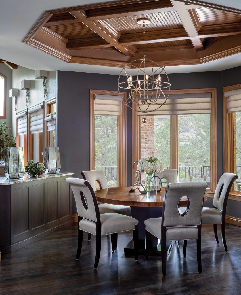
Photos by Emily Minton Redfield, courtesy c2Design
HARDWARE HIGHLIGHTS
The complementary hardware pieces tie the space together, so it all jibes. “Cabinet hardware selection is so important, and is really the ‘jewelry’ of the kitchen,” Ekle says. “We chose a more simplistic pull” that could be spotlighted in multiple sizes.
TOP NOTCH
Ekle opted for contrasting finishes on the countertops and island, a move that adds instant dimension to the space and allows the homeowners flexibility. “The island is a beautiful, dramatic granite because this is where they work, eat and entertain and we wanted it to really have a WOW factor,” Ekle says. Conversely, the counter ringing the wall is made of hard-wearing quartz, which can handle the homeowners’ tougher meal prep and projects. “I like to use quartz because it is man-made and therefore much more durable than natural stone—scratch resistant, stain resistant and antimicrobial,” the designer says.
COLORS FOR KEEPS
The Benjamin Moore paint colors have certainly served the homeowners well in all the recent time at home: Ekle went for hues that would stand the test of time, so the homeowners wouldn’t get sick of them. “For the kitchen, we wanted something neutral but warm, so we selected Coventry Gray, a light gray color with a slight blue undertone that adds a little richness to the space.” Kendall Charcoal makes the dining nook feel luxe and moody.
SITTING PRETTY
In a world where backsplashes can be made of anything, from slate to mirror, Ekle surprised the homeowners with an eternally pretty finish: marble mosaic. “We pulled out the beautiful gray, white and taupe tones from the island, and carried it all up the backsplash and back wall to draw your eye up and accentuate the tall ceilings,” she explains.
HIDDEN HOT SPOT
The kitchen drawers follow the latest trend in kitchen design: concealing appliances and generally hiding the eyesores from the homeowners’ field of vision. Says Ekle: “The tucked microwave drawer in the corner of the kitchen under the window is the favorite feature of the room. The homeowner uses it throughout the day to heat up her coffee and says that it’s so nice to have the microwave not in clear sight!” Another bonus: more countertop space.
BEHIND THE SCENES
Another big secret: “The refrigerator is ‘panel ready,’ meaning that we have a panel made to look the same as the cabinetry so it can be hidden,” Ekle says. “The freezer drawers are also tucked into the island out of sight, which comes in handy for late-night ice cream snacking.”
DINING DELIGHT
Hanging something that casts a romantic glow over a dinner table was a must—there is nothing like soft, warm lighting to set a mood. A globe chandelier marries the aesthetic appeal of a historic, kinetic form with a metallic finish Chip and Joanna Gaines would approve of.
C2DESIGN
720.457.1600
Master of Rest
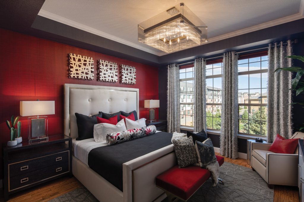
Janet Wettlaufer is among friends when she unwinds in her master bedroom—a posse of contemporary (but not minimal) design details with a sassy streak that prove a confidante can come in all shapes, sizes and expanses of square footage. “This is the most private room for me in the condo—where I have that sense of privacy and the freedom to feel whatever I’m feeling,” Wettlaufer says.
Like her relationship with her interior designer, Gina D’Amore Bauerle of D’Amore Interiors (she’s also known as Design Boss Gina), you could say the friendship was a dozen years in the making. “Janet hired me 12 years ago to do her first condo in this building,” D’Amore Bauerle says. “And we’ve stayed friends ever since.” So, who better to make Wettlaufer’s new home (as of a year ago) in Vallagio at Inverness—shared with her significant other, Larry Wettlaufer—a physical representation of her vibrant look on life?
One not-so-secret ingredient: Wettlaufer’s signature color (you guessed it: red), brought to life even more with a Maya Romanoff “vinyl wallpaper made to look like leather,” says the interior designer. “And then there’s this subtle shading in it that almost looks like a tiger print.”
Furnishings from Wettlaufer’s previous condo a few floors down, picked out by D’Amore Bauerle and Wettlaufer 12 years back, dot the home. In the master bedroom, one such piece shares the stage with unconventional furniture, like a standout sideboard used in place of a traditional dresser. All in all, should you need Wettlaufer or her second half, who also spend time in Minnesota and Arizona each year, “we are happily ensconced in this flat.”
Photos by Timothy Gormley, courtesy D’Amore Interiors 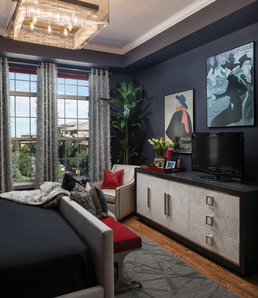
Photos by Timothy Gormley, courtesy D’Amore Interiors
WINDOW FOR THE SOUL
“We really like to travel and like the theater,” Wettlaufer says. “Years ago, I was at an art museum and there was a Toulouse-Lautrec exhibit, where I just bought a couple posters on the way out. I have carried those around with me for forever”—since before she met D’Amore Bauerle, to be exact. “I look at them, one about theater and the other about a singer, and think about the whole backstory of being in Paris in the 1890s, and I can almost imagine myself in those days.”
MEMORY LANE
“On this little red tray, I have pictures of my family and my book of heart stones: I love heart rocks,” Wettlaufer says. “Our whole family is always on the lookout for them—especially when we are on the Minnesota side of Lake Superior, where there are beaches full of rocks.”
WHERE DREAMS ARE SWEET
What is a master bedroom without a plush place to lay your head? Not much, and certainly not any sleeping quarters D’Amore Bauerle or Wettlaufer want to be in—which is one of the reasons D’Amore Bauerle chose an upholstered frame. “It’s literally softer and more luxurious,” she says.
LIGHT FANTASTIC
Wettlaufer never would have chosen the Troy Lighting chandelier to hang over the sleeping space, but, as good friends do, trusted D’Amore Bauerle’s intuition: “Gina says lighting is the frosting on the cake for everything. With this fabulous chandelier, I kind of feel like a princess.”
BLACK, WHITE AND RED ALL OVER
“The color creates the mood,” D’Amore Bauerle says. “I have always loved and will continue to love the black and white concept because it’s a perfect example of two completely opposite things peacefully coexisting, but it still has so much room for interpretation. One of the things I love about it is how it makes other colors look—the combination really makes Janet’s red stand out.”
WAKE-UP CALL
First thing in the morning, Wettlaufer opens the Fabricut drapes—made of fabric that looks like fringed strips of cut newspaper, D’Amore Bauerle says—and looks out over the condo building’s roundabout, “which has beautiful trees. It’s just a great way to start the day. … The shades were one of the splurges; they have this great texture.”
GREAT ESCAPE
D’Amore Bauerle placed this American Leather chair in the master bedroom instead of the living room—where the seat resided in Wettlaufer’s first condo—to give Wettlaufer a place to have time to herself. “I have a sense of really being at peace,” Wettlaufer says. “This is where I can come and sit and read, have a glass of wine and watch the news and more.”
D’AMORE INTERIORS
303.422.8704