By Heather Shoning
Photography by Amanda Proudfit
A husband-and-wife home flipping team uses their OWN FAMILY FOR DESIGN INSPIRATION
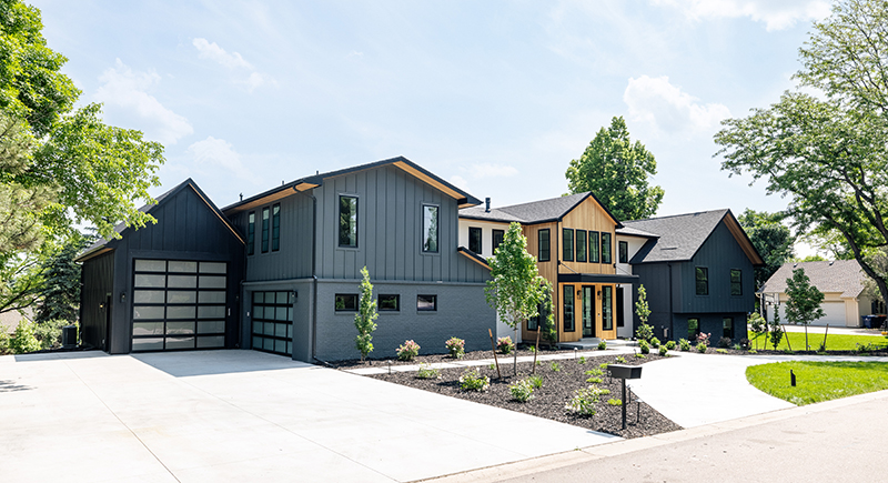
The modern farmhouse style is apparent as you approach the home, and it is a perfect way to blend the home’s sections. The far-right and far-left brick sections are the original footprint of the house. The Nyhuses, in conjunction with the Cult Creative team, came up with inventive ways to capture more space, taller ceiling heights and an open, airy feel conducive to today’s lifestyle.
Kim and Dustin Nyhus love quality ’70s-era homes that haven’t been touched since they were built. Think: shag carpet, wood-paneled walls (not the pretty kind) and copious amounts of mustard yellow, avocado green and burnt orange. They are the husband-and-wife fix-and-flip team behind New House Properties.
“We gravitate to 1970s ranches and tri-levels like this,” Dustin says. “We try to focus on the Greenwood Village and Englewood areas because you can get original floor plans that are typically pretty good already. So, with minor changes and additions for modern life, you can turn a home into something really special.” That was the couple’s hope when they bought this Greenwood Village tri-level to fix and flip. Scope creep had different ideas. As the couple got into the project, they realized that doing the flip right and making a great family home would require more than just cosmetic changes. And they’d need an architect to do it. Enter Cult Creative.
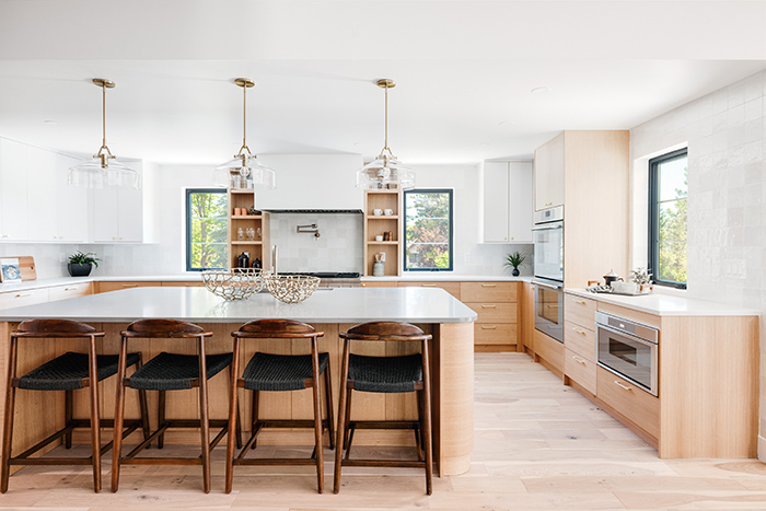
Left: Dustin likes having control over the cabinetry in the homes he and Kim flip. He tries new processes and design elements, and in this house, he incorporated the curved island, which Kim had longed to do. The perimeter cabinetry is topped with white quartz, while the island has gray quartz to set it apart. Delicate glass pendants keep the space bright and don’t impede views through the room.
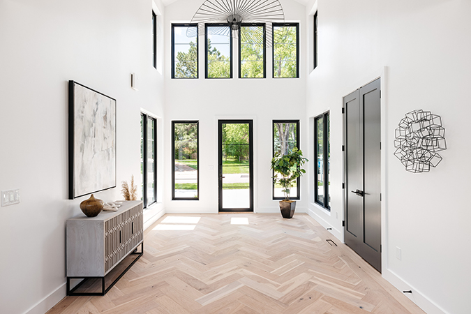
Right: “I really love the entry. That was a light fixture I had been wanting to use for years and just have never had a space to use it,” says Kim. “When we finished the herringbone floor, I just had a hallelujah moment, where I sat in there and thought, ‘Oh my gosh, I am obsessed with this entry.’” The striking white oak floor helps keep the space bright yet sophisticated, and the chandelier by Petite Friture adds movement and a touch of drama.
“We thought we were going to do a pop-top and that we would take the roof off and be able to use the existing framing and just build up from there,” says Brooklyn Doherty, co-owner of Cult Creative, along with co-owner Erin Anglin. “Once we got into demolition, the existing studs were somewhat rotted, and there was a lot more that needed to be removed than we had originally anticipated. That was a big surprise, but it gave us an opportunity to have a little more flexibility in the floor plan.”
It also allowed the Nyhuses to harness their inspiration for the home’s design. “We put ourselves in every home we design—we design it with our family in mind because we have three boys, two dogs, and we’re a super active family,” Dustin says. “We design the layout and features around what we would need and want in a home, hence the toy garage in this particular house.” They use themselves as the model for the active Colorado family to ensure they’re creating homes buyers want.
Cult Creative suggested a general contractor to guide this now-larger project to fruition. It’s not uncommon for us to see projects that increase in scope over the course of the project as the design develops,” says Justin Bride founder and principal of Ascent Contracting. “There’s more work that is either necessary or will provide more value such as vaulted ceiling.”
Dustin uses the houses they remodel as testing grounds. “We flip homes because we love the hands-on design,” he says. “I also use it as a beta testing ground to develop products. A lot of it is built in my shop, from all the cabinetry to any of the special features of the home. I like finish carpentry and enjoy the prototyping of various products and techniques.” Dustin built all the cabinetry and built-ins in this home, the stairwell design element, and the dining room feature wall.
As the couple looked to their family for design inspiration, they quickly realized the original plan for the kitchen would not work. “The kitchen was much smaller, and when we walked the space during framing, we completely changed it because we realized it would not work for our family.” As such, they added more cabinetry and a giant pantry. “Even after the drawings were in place, we were able to make creative design decisions while the project was in process,” Bride says.
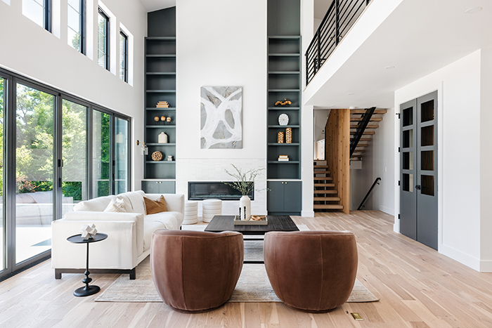
The double height in this room, which the former version of this home certainly did not have, is a hallmark of contemporary homes. It creates a whole-home connection by being open to the loft above. Using the total height with the fireplace feature wall and flanking bookcases highlights the vastness, although the seating arrangement is still intimate and cozy.
The couple liked the quad-level floor plan for a larger family. It allowed for more bedrooms and separate toilet rooms in the shared bathrooms, so the kids don’t have to take turns getting ready, which makes getting out of the house in the morning much smoother. “We were envisioning having a game room up there for the kids, a little hangout area, and then some separation from the primary suite, but still within arm’s length because you’ve got to be able to communicate with the kids,” Dustin says. “With this layout, it just worked so perfectly to be able to communicate wherever they were in the house.”
In addition to making sure the house functions well for potential buyers, aesthetics was, of course, top of the design duo’s minds. “I’m a person who just likes a lot of light in a house, and so that’s always the first thing that I’m looking at when we walk in: How can we maximize the light?” Kim says. “I can’t believe how bright this house is. It was so dark before—it was like a cave with all those dark colors on the carpets, and it had a bunch of stone on the walls. It is such a huge transformation.”
Being one of the first homes in the neighborhood to undergo a major renovation can be tricky. The Nyhuses didn’t want to go too far outside the context of the community’s style, but they also wanted to be sure to be on the front edge of the trend for the area. “I think the house is modern, but it doesn’t stick out like the sore thumb,” Kim says. “It is maybe a little more modern than what’s in there, but we’ve started to see other houses receiving some updating.”
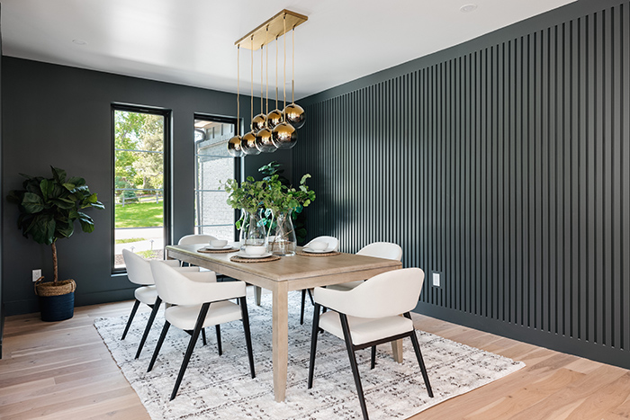
Design-obsessed Kim is always searching for new ways to make spaces feel unique, so when she saw a photo online that inspired an idea for the dining room wall, Dustin got busy in his workshop. “Since this is a very open house, it felt like it would differentiate the dining space,” Kim says. Enveloped in the dark wall color and shining with the West Elm gold globe light fixture, the room has a separate-yet-together ambiance.
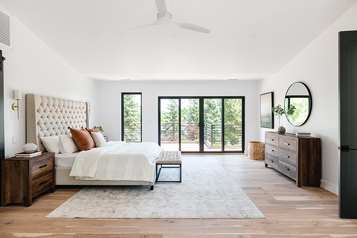
The primary suite is vast and inviting. There’s a double-door entry and a sliding barn door to the bathroom. It has a private balcony overlooking the backyard. In addition to ample space for the bed, side tables and a large dresser, there’s a seating area perfect for reading or morning coffee.
Although many of the homes in the neighborhood lean toward traditional styles, this new contemporary farmhouse style fits into the somewhat pastoral feel with the oversized lots and mature trees. “Bringing in a more contemporary aesthetic was fun in this neighborhood,” says Anglin of Cult Creative. “Right behind this house is a walking trail. The deck off the back house, the big sliding glass doors, greenery, trees, and trails all connecting to the backyard are beautiful pieces about this house.”
Today, the 8,000-square-foot, 6-bedroom, 4 ½-bathroom luxury residence has a two-story living room space, kitchen with an adjacent service pantry, a rec room with a built-in bar, and it’s setting a new standard for the neighborhood. The home also has a standard two-car garage plus an oversized recreation garage.
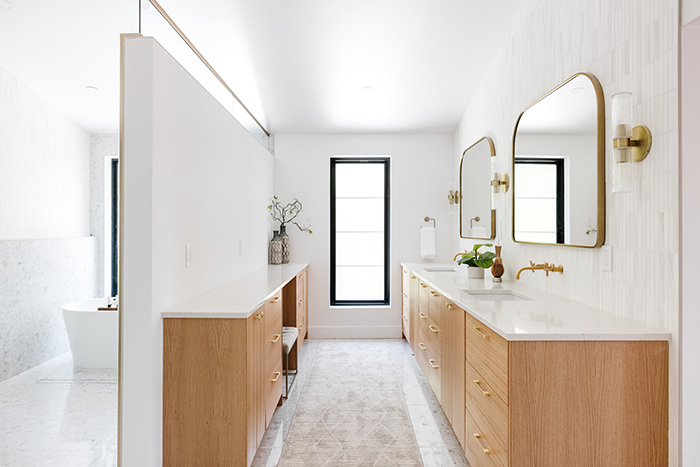
The primary bathroom is equally grand, with ample cabinetry, double sinks and an oversized double shower room with an incorporated soaking tub. The shower room takes its unique look from the agglomerated marble tile from Arizona Tile. Kim added elegant touches throughout the space, including brushed brass fixtures, mirrors and delicate sconce lighting.
Project Resources
Wood flooring, RW Supply + Design
Foyer lighting, Lumens.com
Dining chandelier and island pendant lights, West Elm
Kitchen countertops, Arizona Tile and The Stone Collection
Kitchen appliances, Thermador
Primary bathroom backsplash, Floor & Decor
Primary shower floor and walls, Arizona Tile
Windows and exterior doors, Anderson Windows & Doors
Living room sliding window wall, NanaWall Colorado
______________________________________________________
Ascent Contracting, Inc.
3016 W. 32nd Ave.
Denver
720.282.9080
ascentcontractinginc.com
Cult Creative
400 S. Broadway St., Ste. 4
Denver
303.578.0795
cultcreativedenver.com
Amanda Proudfit Photography
720-320-1857
@amandaproudfit
www.amandaproudfit.com

