By Heather Shoning
Photography by Denver Image Photography
Design details make a BIG IMPACT without wasting quality materials in a Greenwood Village remodel
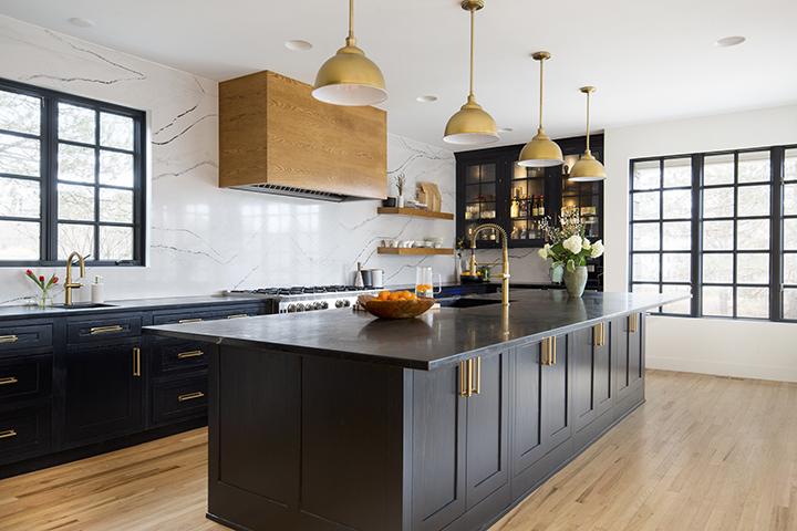
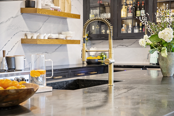
Refinishing the existing kitchen cabinetry was a huge budget- and waste-saving design choice. Bravo was able to achieve the black cabinetry finish the homeowner wanted, then punctuated the space with soft brass finishes for contrast and a sophisticated style.
IT’S EASY TO GUT A HOUSE and start over, but there’s a certain amount of finesse involved in working with existing design elements while creating a fresh feeling and designing a home for the way new homeowners want to live in it. Designer Margarita Bravo took that approach for redesigning a Greenwood Village home for a family relocating from Los Angeles. While the new design did call for some structural changes to open up certain spaces, and she did eliminate some architectural elements, the designer was careful to coach her clients through using existing components—especially major ones—by refinishing them to achieve the desired effect.
Two areas that saved the homeowners not only thousands of dollars, but also saved perfectly good materials from being landfill fodder were the windows and the kitchen cabinetry and countertops. The exterior of the transitional Cape Cod–style home was in great shape, so Bravo just specified a new paint color and upgraded exterior lighting. But when the client wanted black metal-framed windows, Bravo offered an alternative—to paint the existing windows black both inside and outside, then eliminate the window casings on the interior, replacing them with a wrapped drywall edge. “The biggest thing was for her to have that aesthetic,” Bravo says. “We were able to accomplish it for a minimum portion of what brand new windows would have cost, and they turned out really well.”
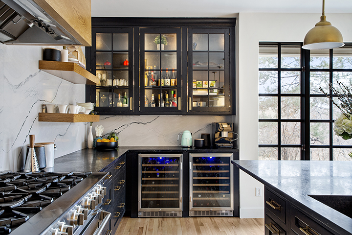
It was important to the homeowners to have a separate beverage station, so Bravo designed new cabinetry to mesh with the existing and added refrigerators in the lower section.
Because Bravo has several design studios across the country—including Miami and Montecito—under the firm name MARGARITA BRAVO, she’s accustomed to working across a variety of design styles. And although the design firm—which she started in 2015 after a career in engineering—specializes in beginning-to-end design and project management, she’s always careful to let her clients’ identities and styles guide the process. Strong relationships with real estate agents help her connect with clients early in the home-buying process so she can be involved from the very beginning, which is exactly how this project started.
When she first met with them and toured the home, she was able to help them understand how they could change the structure to meet their needs, along with providing ballpark numbers, so they could make an informed offer on the house. “It’s a house that was built 30 years ago when there were more closed-off spaces,” Bravo says. “We wanted to open it up as much as possible, more in the entry into the kitchen area, and there were a couple of different structural pieces that we had to do in order to accomplish that.”
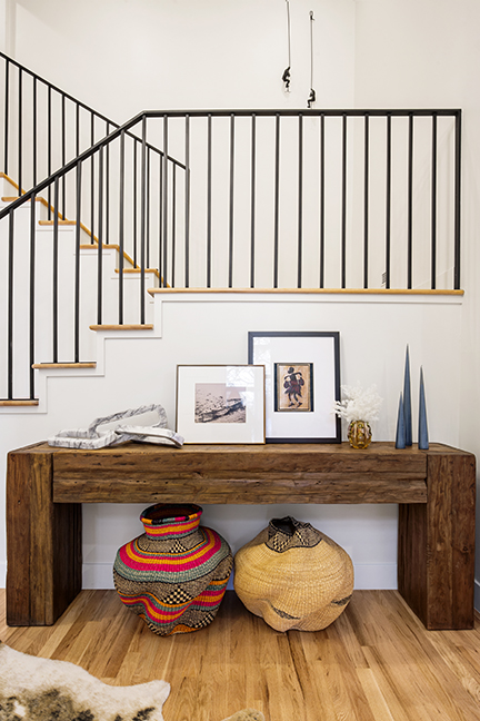
Once they opened up the entry and rebuilt the staircase and replaced the railing with a modern style, Bravo suggested refinishing the kitchen cabinetry. “It was a whitewash wood, but she wanted to have black painted cabinets, Bravo says. “We had to be creative. And keeping in mind, it’s not about affordability or having the budget, it’s also about being mindful of reusing the resources.” The team tried several paint samples until they were able to achieve the look the client wanted. The homeowners did want to add a beverage station, so Bravo added some cabinetry wine refrigerators. To bring warmth and richness to the space with dark cabinetry and dark countertops, Bravo changed the design style of the kitchen hood to incorporate warm wood tones and opted for brass hardware, fixtures and lighting. “We wanted to make sure we had some elements that created contrast, that created a breaking point between all that darkness,” she says.
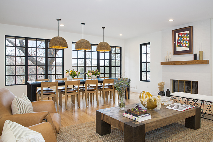
new in areas that previously had carpet. From the beginning, the designer knew the homeowners would be bringing furniture
from their California home, so she planned for it from the initial design phases.
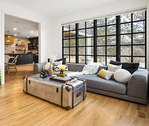
Off the kitchen, there had been a small doorway leading to a formal dining room. Because this family with three children and a dog, wanted open-floor-plan living, Bravo opened up the wall and turned the old dining space into the family room. The other direction, the kitchen is wide open to the dining area and living room. Bravo kept the brass fireplace but designed a new brick surround with a warm wood mantel, drawing the elements from the kitchen across the large room. Although the family remained in LA during the remodeling project, Bravo was mindful right from the beginning of the furnishings they already had and planned to bring into the new home.
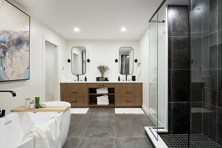
enjoy a separate water closet, oversized shower, freestanding soaking tub plus a double vanity with plenty of storage.
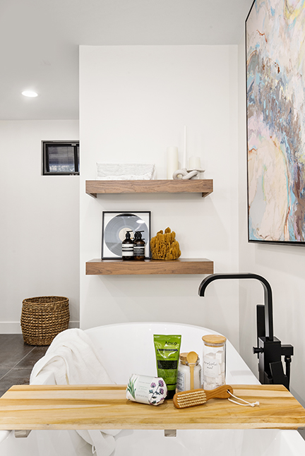
The primary bathroom was another space the needed Bravo’s design creativity. It had lots of wasted space, and L-shaped vanity that wasn’t functional and a miniscule shower. Bravo was able to reconfigure the space to include an ample double vanity, water closet, freestanding tub and a large glass-enclosed shower.
“We love projects with all these challenges,” Bravo says. “We’re determining how we’re taking it from point A to point B and finding all those elements that can be reused, that can be tweaked, that can make the house look brand new house without tearing everything down and starting from scratch.”
Project Resources
Kitchen hood: Designed by Margarita Bravo
Hood construction/cabinetry refinishing/window refinishing:
Deluxe Design and Construction
Hardware/fixtures: Ultra Design Center
Lighting: Urban Lights
Primary bathroom shower tile: Total Floors
Bathtub/fixtures/sinks: Ultra Design Center
Vanity: BKC Kitchen and Bath
Mirrors/ Powder bathroom lighting: Urban Lights
Primary bathroom lighting: Visual Comfort
Powder bath vanity: BKC Kitchen and Bath

